

EyePACS provides clinics with resources to detect and prevent blindness
Diabetic retinopathy is the leading cause of blindness in working-age adults. Up to 95% of diabetes-related blindness is preventable with timely detection. EyePACS' mission is to provide clinics with the technical resources needed to detect diabetic retinopathy.
EyePACS is a clinically validated, web-based system that uses store-and-forward technology to facilitate the diabetic retinopathy screenings. EyePACS provides local clinics the tools needed to provide preventative care to help patients get the timely detection and treatment that they need to prevent diabetes-related blindness.
📸 Capture
Clinic captures a patient's retinal images using a professional retinal camera

📝 Interpret
Clinical consultants from EyePACS assess the retinal images and provide a diagnosis
💬 Inform
EyePACS sends a report to the clinic, and the clinic communicates the diagnosis with the patient
EyePACS received feedback about complex user workflows
The EyePACS system requires users to take many steps to complete a single diabetic retinopathy screening. Pictured below is the steps that a retinal photographer must take in order to fully complete just one patient screening:
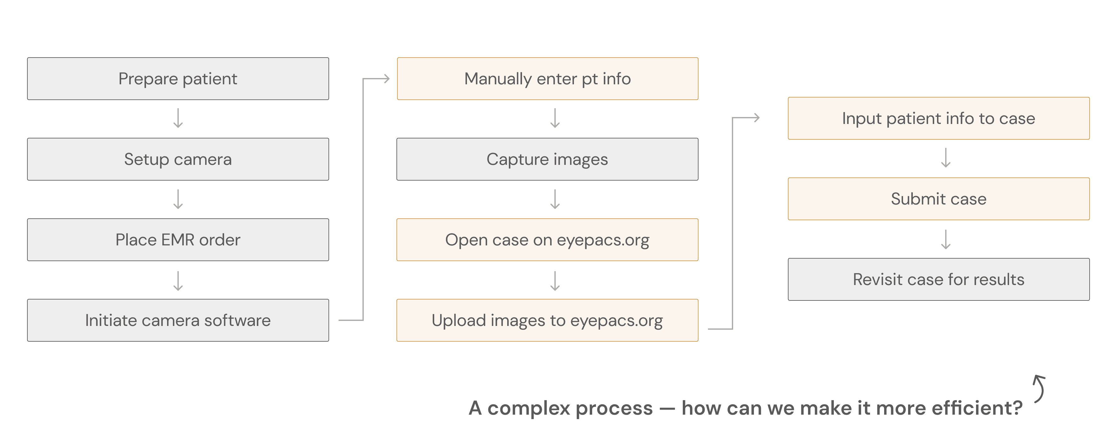
The 'AutoUploader' was developed to simplify workflows, but wasn't user friendly
The "AutoUploader" was to simplify the steps highlighted in orange in the user workflow above. Ideally, this program would allow retinal photographers to seamlessly upload and manage patient cases without having to switch between multiple windows.

However, clients expressed that this new product was not user-friendly, describing it as complicated and unintuitive. My job was to investigate this user frustration and design a new solution.
In order to explore the complex issue, I used several research methods
Semi-structured interviews
to gather user experiences and expectations to identify areas of growth
Contextual inquiry
to gain insight on real-world usage and observe users in their natural environments, which is completing a retinal screening
Heuristic evaluation
to assess the existing software against recognized usability principles to gain an objective, structured perspective
Moderated usability testing
to gather user feedback and assess their ability to perform tasks with the new product
Interviewing key users and uncovering their pain points
There are two key user groups that closely work with the EyePACS screening process that I decided to focus my research on:
Retinal photographers
Responsible for the capture and upload of patient retinal images onto EyePACS
EyePACS staff
Responsible for training photographers on the EyePACS workflow and troubleshoot technical issues
I met with several users from each key user group shown above (n=11) and performed semi-structured interviews. It revealed:
Retinal photographers struggle to remember how to use the product after being trained
Photographers, the main users of this program, have trouble remembering the workflows that they were trained on and feel that they need to constantly reach out to EyePACS for help.
Training staff are overwhelmed with training and support asks
Staff report that the program is difficult to use and troubleshoot, resulting in a lot of their workload being centered on troubleshooting.

Contextual inquiry for real life user experience insights
What users say =/= what users do, so I considered contextual inquiry to be an important step for this project's research process. My goal was to understand how key users were interacting with the AutoUploader in its real context and in what ways it was not meeting expectations. The contextual inquiry (n=6) revealed:
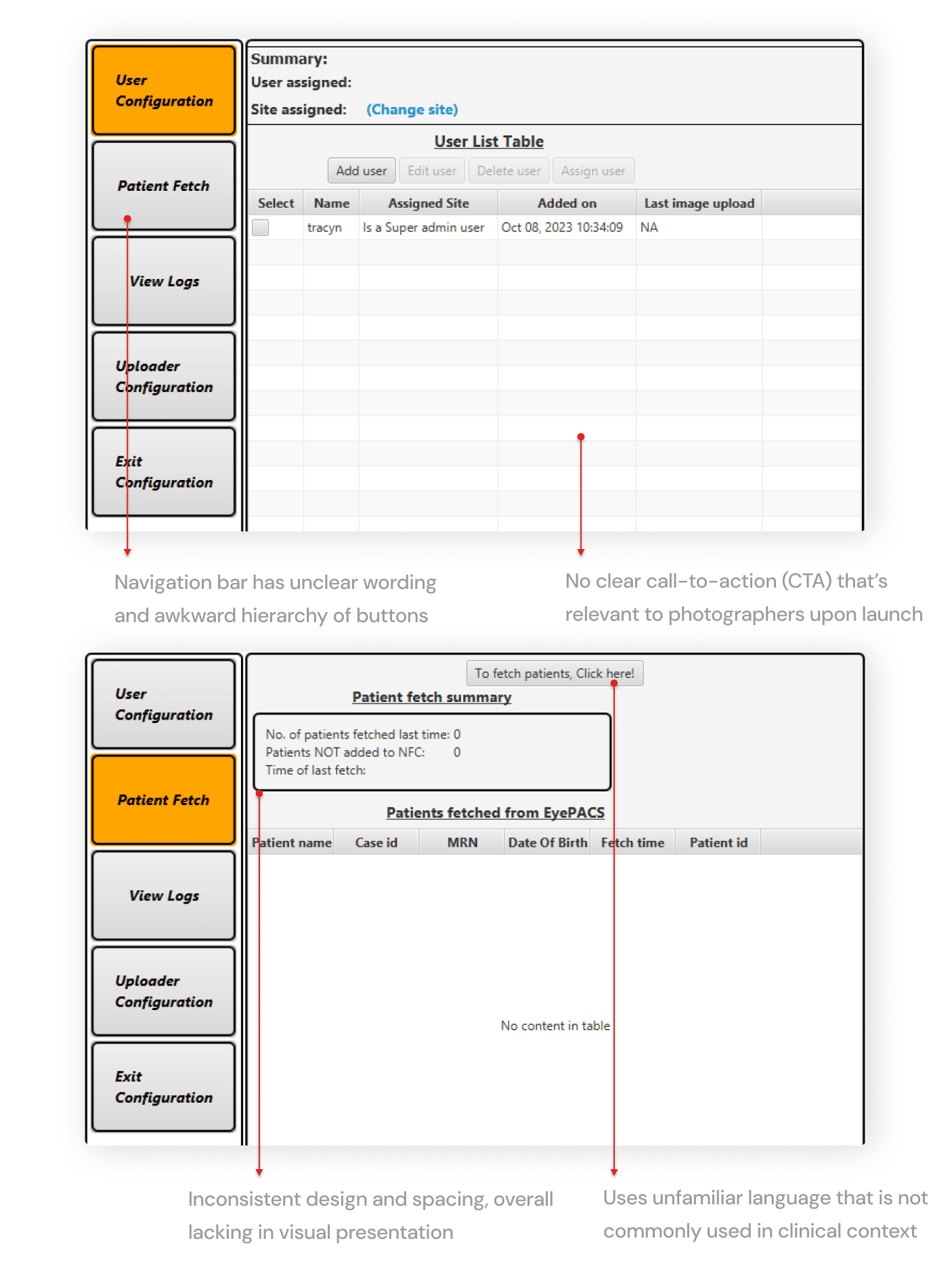
Lots of lagging between steps
There were no clear call-to-actions (CTAs) with each step in the AutoUploader, causing users to be confused about what they were supposed to do next
No support available
When they were stuck on a step, there was no easy way to troubleshoot or reach out to support to get help. Their only option was to email EyePACS support and wait for a response.
Not enough feedback
Often asking, "Did it work?" after completing certain steps - there wasn't enough feedback for users to know whether they are progressing correctly.
Understanding the software's objective weaknesses
After gaining insights from the interviews and contextual inquiries, I conducted a heuristic evaluation to assess the existing platform against standard usability principles to get an understanding of the product outside of the user.
Turning research insights into design opportunities and requirements
At this point, I had gathered insights on the problem through three different ways: (1) semi-structured interviews, (2) contextual inquiry, and (3) a heuristic evaluation. Below are my takeaways for actionable ways I can act on my findings:
Users are confused, so we need to prioritize how we can make it intuitive
In a fast paced environment like a clinic, photographers don't want to and shouldn't keep patients waiting as they try to figure out how to use the program. There should be clear CTAs to ensure that photographers know what to do and when to do it.
If users cannot get help immediately, we need to prioritize learnability
The designs should follow workflows that the photographers are already familiar with to ensure that training and retention of information is easier.
Because the design does not follow basic heuristics, there needs to be a product revamp
From visual design to information hierarchy, the design had to be reworked as a whole to strengthen user trust and intuition, but still say true to its original purpose.
Gathering and iterating based on stakeholder and user feedback
I was asked by management to completely re-design the product instead of simply fixing the existing solution. This meant that I would need to outline new user flows. Given the user flows, the management team wanted it to be designed as a dashboard.

I asked for user feedback from 7 users, with a focus on asking for what they liked, disliked, and what they wanted to see. Most of the feedback was towards the homepage, patient list page, and overall workflow.
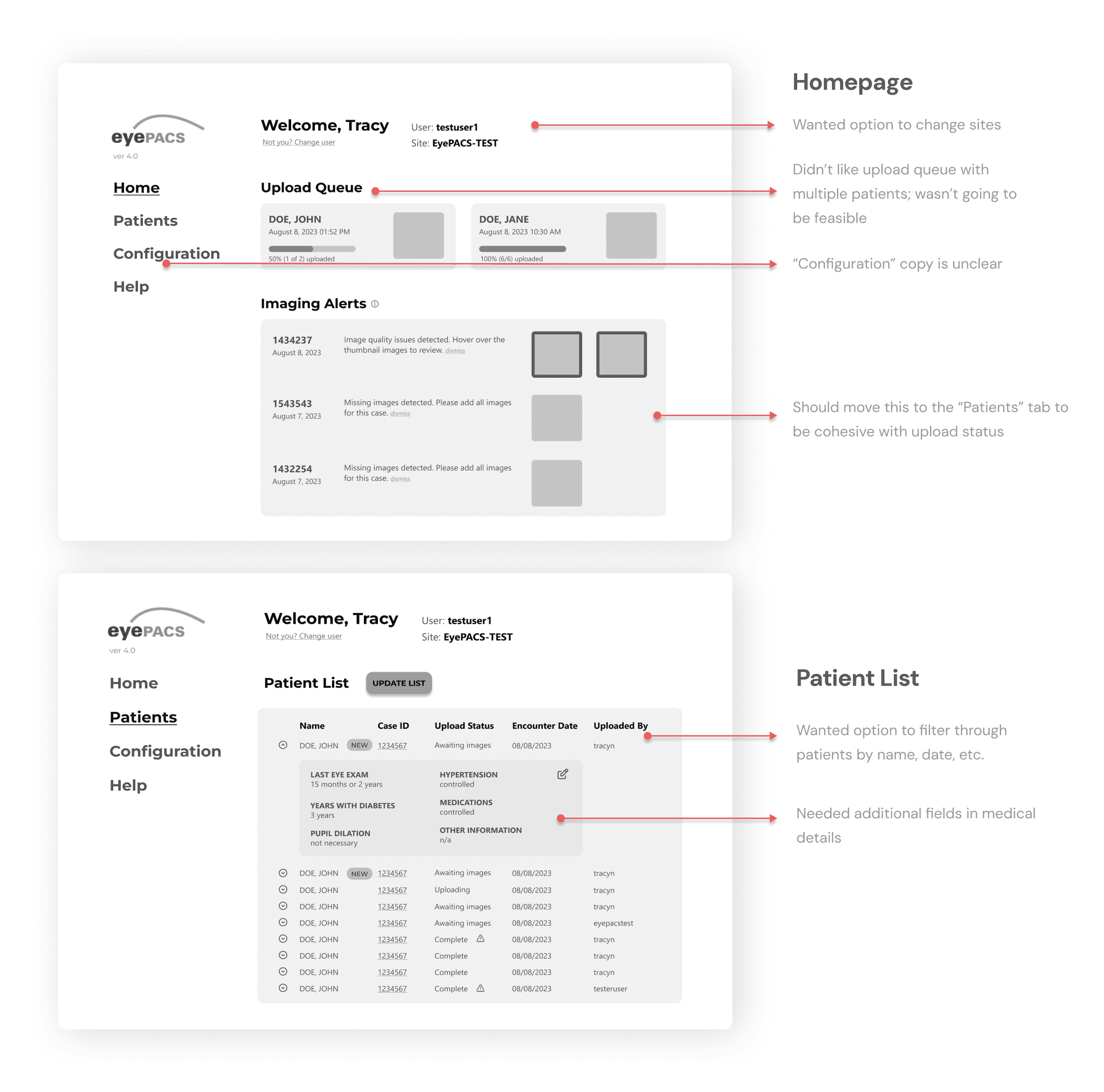
Given the user & stakeholder feedback from the low-fi prototypes, I applied it to these mid-fidelity prototypes below:
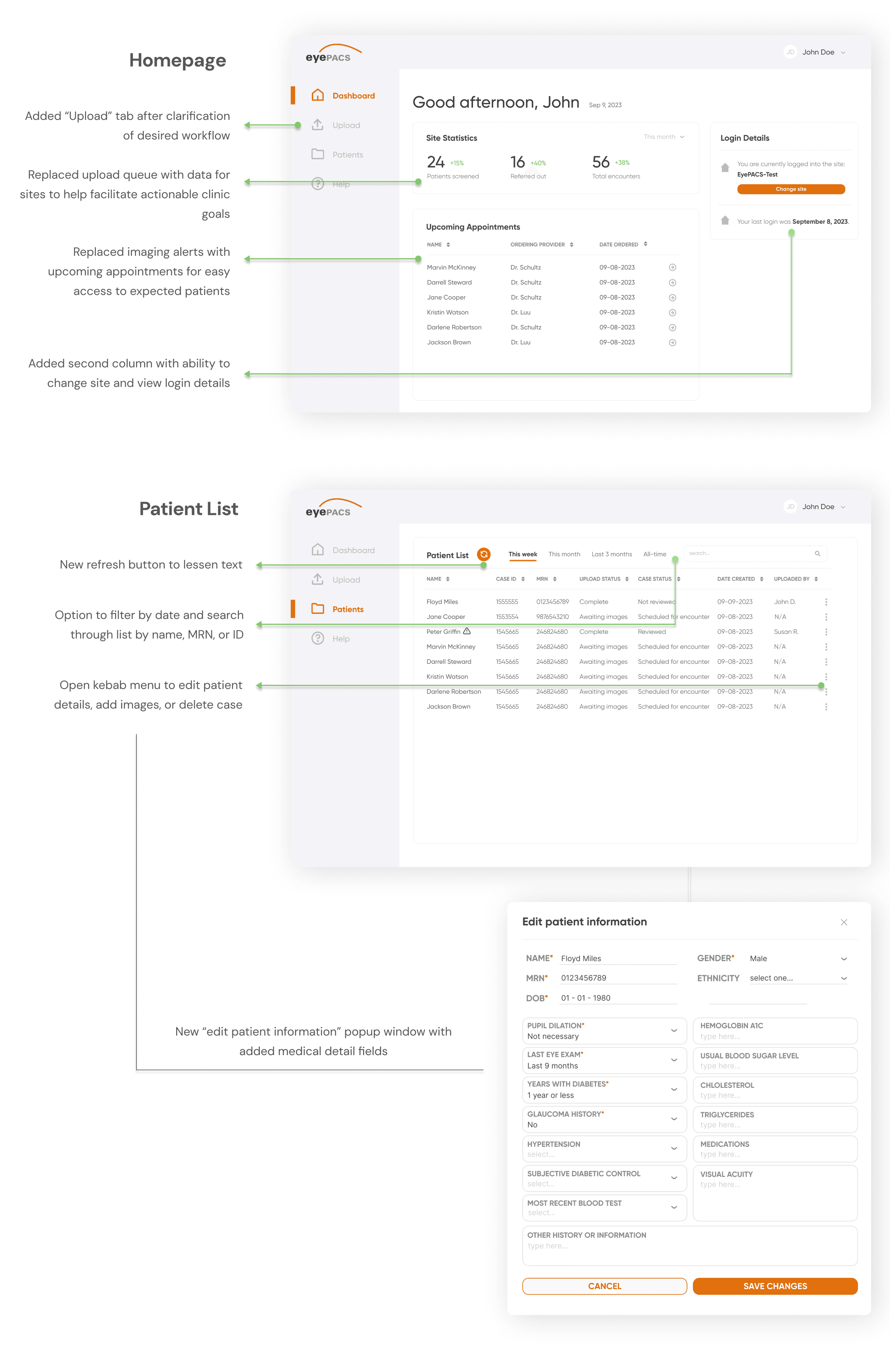
Below is the 2nd iteration of the prototype after the first round of feedback.

Third round of iteration: validating the designs with moderated usability testing
As part of the usability testing, I asked my users (n=5, consisting of EyePACS training staff and retinal photographers) to complete the following tasks while speaking their thought process out loud. The following are the tasks and their success rates:
Upload a patient case
3 out of 5 users were able to complete this task (60% success rate)
View the patient list and edit a patient's information
5 out of 5 users were able to complete this task (100% success rate)
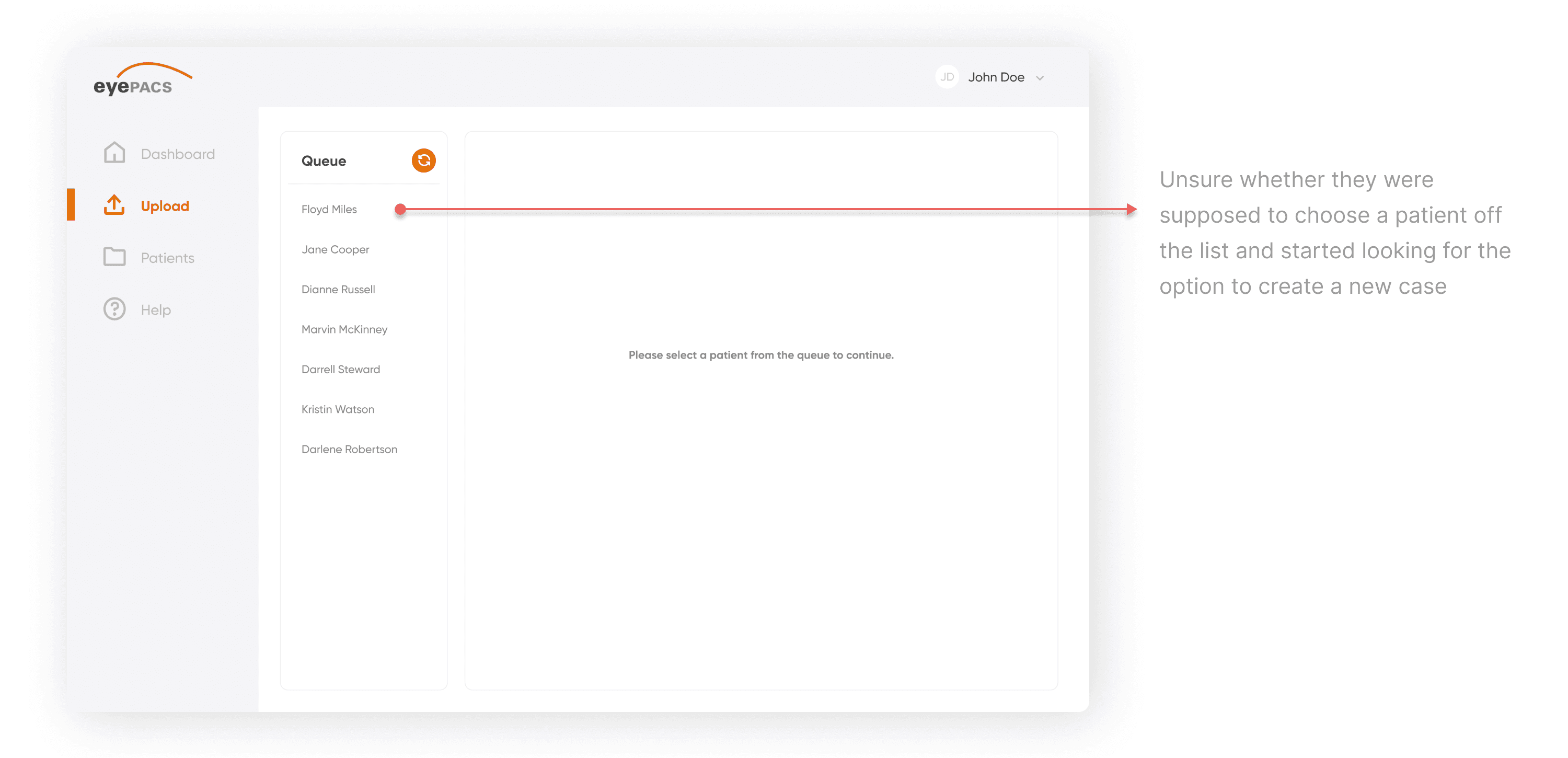
Task #1 had a 60% success rate and I found the following user pain point:
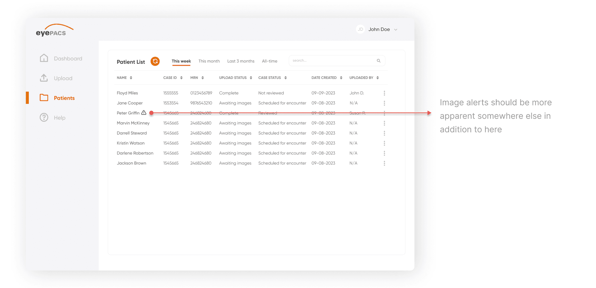
While task #2 had a 100% success rate, users left additional feedback for the final iteration:
Balancing stakeholder preferences versus best practices
During a mid-fidelity review with a senior stakeholder, we encountered a disagreement regarding the landing page design for the dashboard. The stakeholder preferred the "Upload" tab as the default, while I had intentionally set the "Dashboard" (Home) tab as the landing page. I defended this decision based on user flow and UX heuristics, ensuring that users would have an overview upon launch rather than being directed straight to a task.
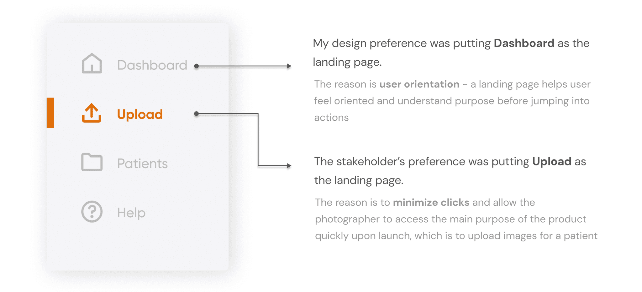
After further discussion, the solution agreed upon was minimizing clicks for the user and setting “Upload” as the landing page to prioritize less clicks for the photographer.
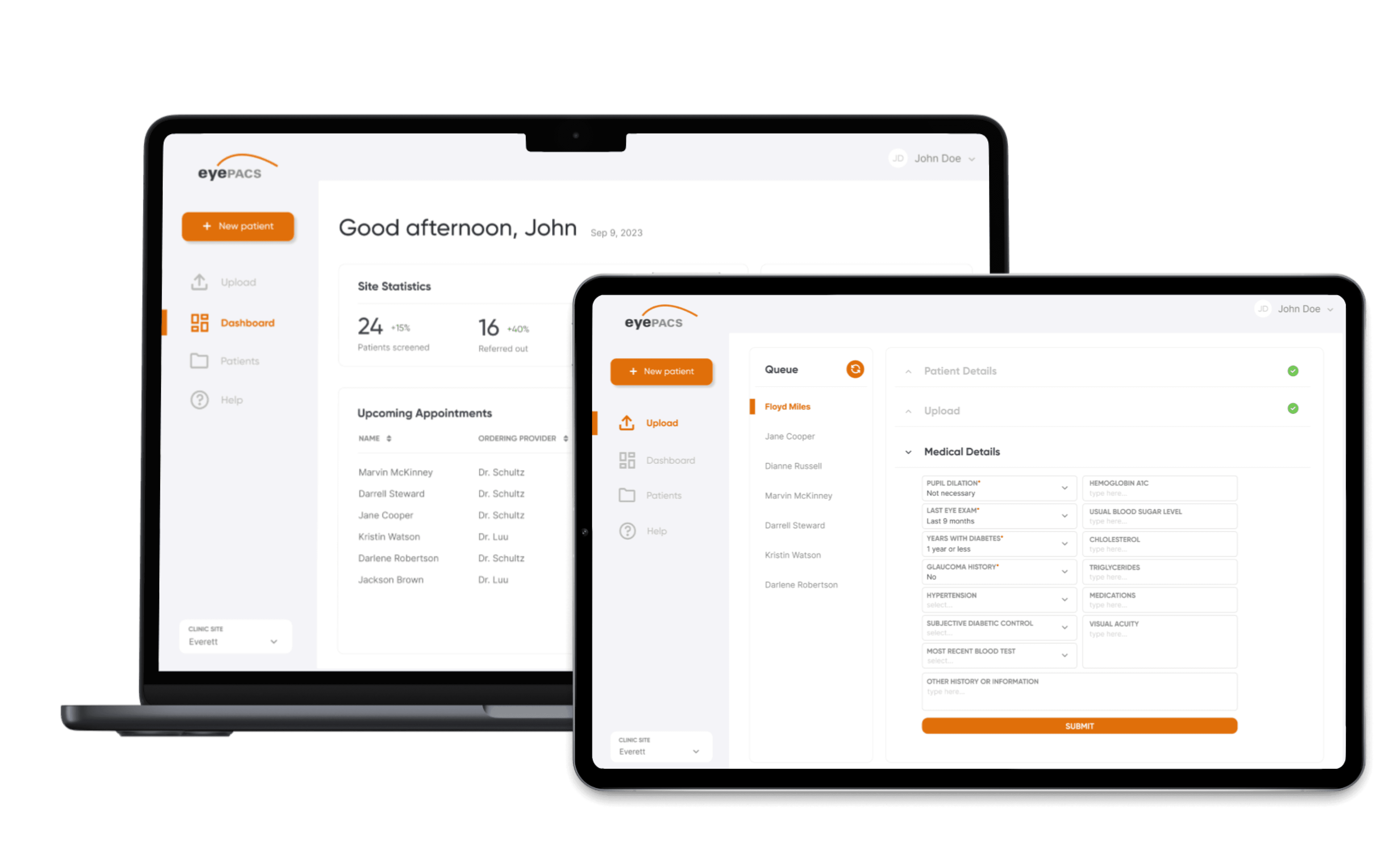
Last round of design iterations before the final deliverable
With this new feedback, I moved onto the last round of design iterations before the final deliverable. At this stage, it was crucial that I balanced both business and user needs, especially given the discussion I had with the stakeholder about our different beliefs in how the design should be.
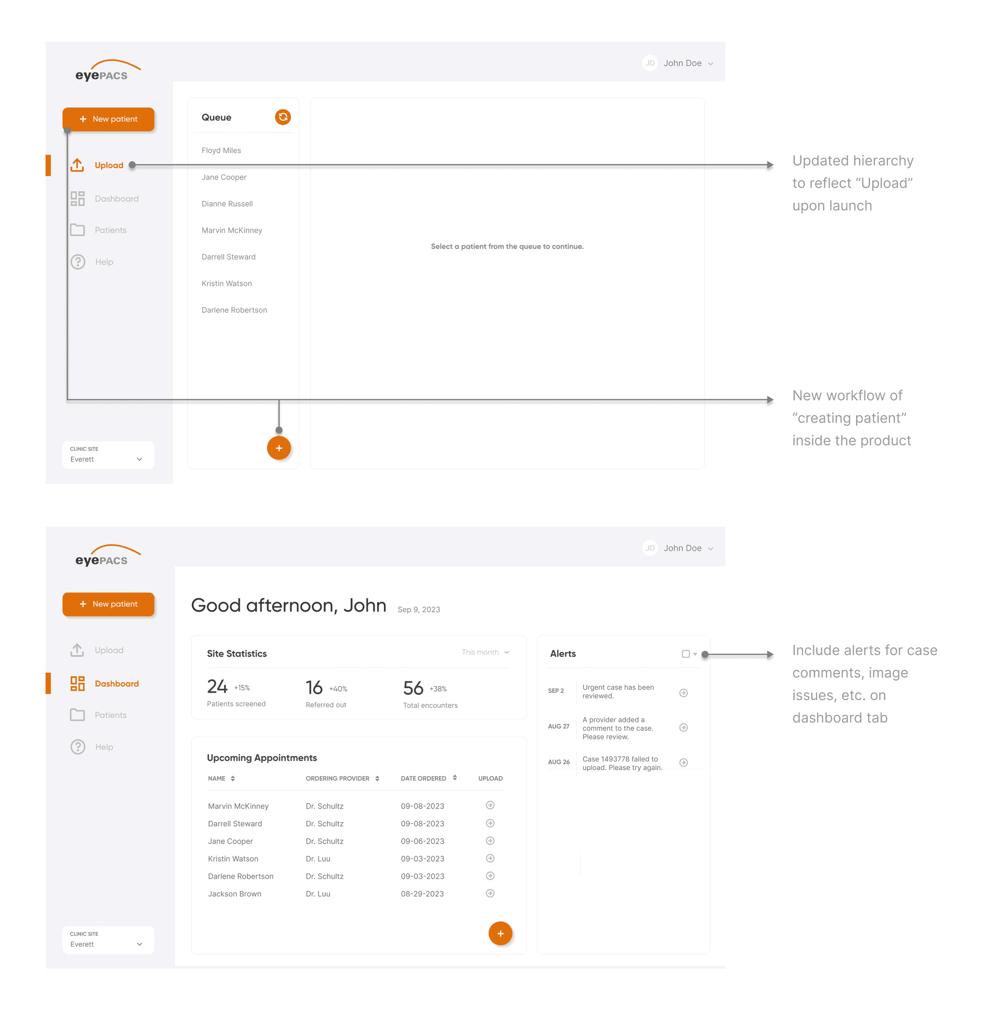
This final prototype was approved by senior stakeholders and engineers for development, following alignment on both the user experience and technical feasibility. The design effectively addressed key user needs and met the project’s business objectives, which was to streamline the retinal screening process into one efficient platform.
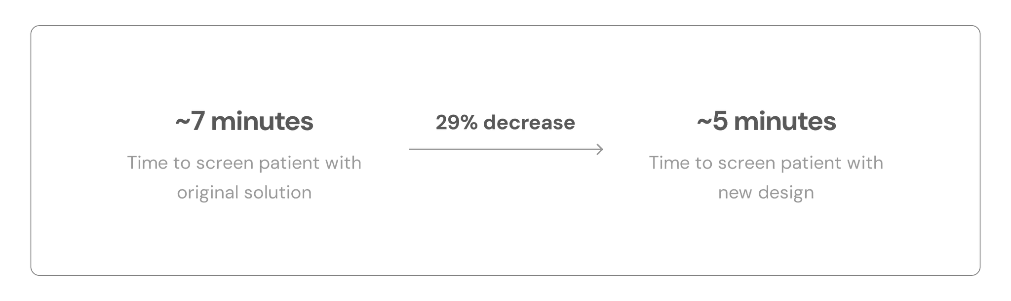
How we defined success and measured the impact of the new design
We arrived at these impact metrics after doing real testing with the AutoUploader, keeping in mind both the image upload times and the time that it takes to type in patient information. We arrived at an approximate 5 minute run through with the Figma prototype that I shared with the team, keeping in mind those extraneous times.
This was an incredibly valuable learning experience with lots of takeaways
Defending your design decisions
When discussing designs with stakeholders, disagreements are bound to happen. In those cases, I strongly believe in at least explaining my stance first, even if it doesn’t end the way I had originally planned. Voicing my thought process, hearing feedback, and learning from it is important for my growth as a designer.
Involving developers early-on
One of my biggest regrets for this project was not involving the developer early-on to discuss feature feasibility. It solidified the idea that design is certainly not possible solely through the hands of the designer, and it’s imperative that we work cross-functionally to ensure all moving parts are accounted for.
Designer responsibility
I discovered many user pain points were linked to the product's functionality, which is under the responsibility of the developer. Although I can't directly influence this aspect, as a designer, I can collaborate with the developer to incorporate all necessary workflows into the design, aiming to prevent as many issues as possible from arising on my end.
Be ready for change
This project started with no other goal than to improve it. Since the team was new to UX, once they had seen the low-fi and mid-fi prototypes, they had a lot of suggestions. It was important that I was open to those suggestions and kept an open-mind to making necessary changes to the original user flows to ensure that the product met business goals.